Wednesday 30 September 2009

Psycho, 1960


Everyone knows the shower scene from Hitchcock's horror film, Psycho. I know it's very dated now but it is undeniably a scary scene. Everyone gets a bit nervous around a shower curtain for a bit after watching this film. But have you watched this scene on mute? It is all about the music. That screeching sound effect, the loud jagged tones are terrifying. The fake knife and shadowed man are not. It is amazing how much the music in a movie is taken for granted. At school ,I remember we tried to compose our own music for this scene. It never worked. Despite special effects and the huge budgets films have today, without the music there is no horror.

The Rolling Stones Album Cover

This is a fantastic album cover and all it took to make it was a camera and a red pen. The public toilet was discovered in this exact state; filthy, vandalised, unwelcoming. Added were the words, "The Rolling Stones" on the wall and made it their own. I like the concept of using your surroundings and this is taking that concept further. SOme of the graffiti on the wall reflects the music and the scene the Stones were about and the scene, although depressing, suits them. It is why the image appears so natural, because it is. There is nothing worse than staging a "natural" setting or scene, and not being able to pull it off. I think this album cover accentuates how simple design can be if you get it right.

The "Big 4"


I saw this not all that long ago, outside Channel 4 headquarters and thought it looked amazing. It was done by Stephanie Imbeau, a fine art graduate at Newcastle University and it is called "Shelter". She is the fourth artist to win the competition to put her own mark on the 'Big 4'. Following the likes of Turner Prize nominee Mark Titchner, she designed the sculpture with over 1,000 umbrellas to cover the standard Channel Four scaffolding. She got most of the umbrellas from London Transports Lost and Found and she explained, "Using broken umbrellas can also be seen as the re-telling of a story, the giving of second life." She is from the USA and says she sees umbrellas as a "visual representation of London and its many inhabitants." I can see why, considering our weather!

Nick Knight's Heart, 2007.

El Anatsui's attempt in 2008, with newspapers, encouraging us to contemplate the news we receive daily in a different way...

But I love the random nature of the project and how aesthetically pleasing hundreds of overlapping umbrellas can turn out to be. Such as in the adverts, it is constructed out of separate parts and so relies being seen from one specific angle. I like this because the constructions catch peoples attention because they can't work out what it is. If you are traveling by, on a bus or in a car, as you move directly in front of the sculpture, it's nature becomes clear and you feel satisfied knowing what it is. From the very early traditional "4", made from coloured building blocks, the adverts have evolved and become more and more advanced. They have created a never-ending method of producing their logo.

Words are Pictures


I love the concept that, in design, words are not just words when used correctly. They can be used as such a powerful communication tool to get your message across. I entitled this post "words are pictures" because it illustrates how broad the spectrum of possibilities is when using typography. Letters can become shapes, words can becomes pictures...
I stumbled across this website where you can create your own "word cloud". It's a very simple method and requires very little skill other than choosing the layout, palette, font etc. But it is an example of how a little imagination can go a long way to making a message or block of text a lot more interesting and, thus more likely to catch peoples attention. With a word cloud, I think the idea is to have words that stand out amongst other relevant words. In my attempt below, the words "design" and "words" are seen first, one through colour and the other through its size and direction of the actual text.


 created on http://wordle.net/

So many people do not realise how big the boundaries are with typography and what you can achieve with it. I did some work experience in the summer with a branding company called Nucleus. I sat in on a fresh project and was blown away by how much thought went into it before the font was even decided. How the letters look next to each other, both in upper and lower case, leading etc etc. It's extraordinary! Here are some I really like.


Monday 28 September 2009

They run one everyday...but not the Flora London Marathon!

Having just posted a blog about my trip to the Maasai Mara three years ago, the extraordinary people I met, how inspirational the experience was and the artistic influence it had on me I am going to mention them again, very briefly. Six Maasai tribesmen decided to play to their strengths and run the London Marathon in 2008 to raise money and awareness for their remote village of Elaui on the Kenya-Tanzania border. Two out of three babies in their village were dying from water borne diseases and, having heard about the marathon through a non-profit travel company working in Tanzania, they decided to try and do something about it. For the full story visit this website:
http://www.timesonline.co.uk/tol/news/uk/article3664431.ece 
and also read these extracts from a diary of one of the tribesmen about their week in London, the first time they had been outside Tanzania: http://www.guardian.co.uk/sport/2008/apr/12/athletics.tanzania
This story confirms everything I said in my previous post about these people having the ability to inspire anyone through the way they lead their lives.

http://www.youtube.com/watch?v=p-dAvKttAXQ

The Maasai


In 2006, I was lucky enough to go on a two week safari in the Maasai Mara. If ever there was an inspirational setting, the Mara is it. For me at least, anyway. The whole experience got under my skin and it has turned into a mild obsession for me since. The infinite landscape, the enormous skies and the abundance of wildlife combined to be the most breathtaking adventure of my life. And I could only imagine that the people that inhabited such a magical place, had to be pretty special themselves...
The Maasai tribe are very well known in Western culture, yet they haven't adopted a single aspect of our lifestyle but remain completely indigenous. Their lives revolve around progressive rituals and their prized cattle.
I was very privileged to visit a Maasai village when I was out in the Mara and even witness a wedding ceremony. We drove along dirt tracks, over the rolling plains, passing endless herds of wildebeest and zebra. The scene is beautiful and gigantic but everything is fairly bland, dry and desolate. Then we approached a small cluster of mud huts, "enkaji" and suddenly see a festival of colour. The bright red cloaks and abundance of multi-coloured beads encircling their heads and necks would stand out anywhere. Groups of them were springing up and down, jumping higher then I could on a trampoline! Women were signing and clapping in such fantastic rhythm, that you couldn't help but dance with them. And they invited you to do so. For people who demand their young teenage sons venture out into the wild and forbid them to return without killing a lion with only a spear, they were very friendly! I watched them for about four hours, mesmerized by their athleticism and humbled by their beaming smiles. They are fantastic people. And skillful. The rugs and beaded jewellry they make is gorgeous, as you can see from images above. The vivid colours are fantastic. I love this style, especially in interior design. And considering my interest in interior design, I love to see entire rooms dedicated to this African style.
I love african art that depicts the Maasai and have a number of prints, some authentic. They always portray the elegance of the people and their simple beauty. 

Tattoos are a skilled Art

I saw this image the other day and I couldn't believe it was done with a tattoo pen and the canvas was somebody's skin! I like this idea, of the human form being the medium, of people showing such commitment to a piece of art that they are willing to have it ON them for LIFE. It has always been a concept that fascinated me and, contrary to what so many people think, I really admire tattoos. I have one myself, although small and fairly discreet but I wear it with pride. Obviously you see some awful mistakes almost everyday but you cannot deny the skill and patience involved in producing some of this art. The examples I have posted here are unbelievable. I wouldn't like to have any of them, they are not exactly aesthetically pleasing but I have chosen these images as they demonstrate such incredible talent that, I think, has to be noticed and admired. The one above is my favourite; how the artist has created a stone texture to the skin and gained point-perfect perspective to make it exactly 3D is, to be honest, beyond me! For those of you who hate them, at least notice the abundance of skill that is involved in creating them.


Wednesday 23 September 2009

He made something that looks easy, but is in fact hard, look easy...


"Here I saw a man who had both broken all the traditions of the past and unified them, who had gone beyond cubism, beyond Picasso and surrealism, beyond everything that had happened in art....his work expressed both action and contemplation." (Alfonso Ossorio)


The work of Pollock that I am interested in is his "action paintings", said to be influenced by Native American sand paintings where they would drip dyed sand onto a horizontal canvas. I appreciate how involved he got in these paintings, how energetic and physical it was to create one. He said he preferred to work on the floor because he felt, more at ease, I feel nearer, more a part of the painting, since this way I can walk around in it, work from the four sides and be literally `in' the painting. His involvement in his work, to me, suggests the man's mental issues. He literally immersed himself in these works, as he said to "feel nearer" to them. When you look at any one of his drip paintings you can only imagine what they depict. The mess he made on the canvas reflected his mental messiness, if you will.
Despite this, I love his work. The common claim of the common man that anybody could do what Pollock did only increases my admiration for him. Because they couldn't. He made something that looks so easy, but is in fact hard, look easy! What an incredible talent. Trust me, I saw on another blog, this website where you can attempt at creating your own Number 1. I spent hours trying to get a good compositional balance etc etc. It is impossible, as you can see for yourself...

As I have mentioned in earlier posts, I tend to favour more traditional art...but who needs tradition when you can paint with a spade! Although it seems Pollock wasn't having much fun when he did his painting, he created a totally new concept that makes sitting at an easel with a paintbrush seem mundane and even pointless.
Jackson Pollock, with fag in mouth, managed to upset the balance of art and open up a world of possibilities to artists after his sad and premature death. What a hero!


The Ingenious Arrow


Mr Lindon Leader created the Federal Express logo in 1994. It may seem an obvious choice to many but I just have so much respect for it. It took him over 200 designs before he realised the words potential. An uppercase 'E' next to a lowercase 'x' can create a very unobvious, abstract arrow ('Ex'). The arrow, as Leader says, acts " as a symbol for speed and precision, both FedEx communicative attributes." Leader then moulded two separate typefaces to create a font that not only enables a perfect arrow shape but also looks appealing throughout the rest of the letters.
But what I really admire about this logo is that the principal attribute, the creative aspect within it is so subtle. And Leader hasn't tried to make it more obvious in order to show it off. Most people don't notice the arrow but he felt the logo had enough standing in itself if the arrow does go unnoticed. Leader explains his decision:

"The power of the hidden arrow is simply that it is a hidden bonus. It is a positive-reverse optical kind of thing: either you see it or you don't. Importantly, not getting the punch line by not seeing the arrow, does not reduce the impact of the logo's essential communication. The power of the logo and the FedEx marketing supporting the logo is strong enough to convey clearly FedEx brand positioning. On the other hand, if you do see the arrow, or someone points it out to you, you won't forget it."

The Woman In Black


I recently went to see 'The Woman In Black' at the Fortune Theatre in London's West End. Far from my favourite production, this play truly portrays the power of stage performance. The theatre itself is quite crooked and old and acts as a perfect setting for this production. The set is basic but so effective and the cast consists of two...or is it three? The plot revolves around the haunting of a young solicitor visiting the house of a dead widow. The ghost of a woman in black is the third character although, to add effect there is no mention of the character at all in the programme, on posters or even some reviews! It is the most terrifying experience of my life and I am still trying to understand how. In comparison to every horror movie I have ever watched, which has the benefits of special effects, incredible sets and millions of pounds to spend on making something scary, they all fall so far short of this play. You could argue that it's becasue you are physically there to watch it, but you are part of an audience which you would think would soften the scare-factor. It doesn't. 

Robin Herford, who has directed it since 1989, has created the most powerful production I know of. He has relied on nothing else other than his direction and the actors performances, (and a few very disturbing sound effects!) and the simplicity of it makes it so effective. Honestly, reading a plot summary three months after having sen it still sends shivers down my spine. Certain moments in that play will never leave me...I wish they would!

KTBFFH

Stands for "Keep The Blue Flag Flying High". I am sure everyone will bypass this post but it wouldn't make sense to jot down my inspirations if I didn't include Chelsea FC. Im a lifelong fan before you judge, I was born into it as a religion! And there is reason and relevance for this post. I get inspired by the atmosphere. Not necessarily at Stamford Bridge but the adrenalin of travelling around the country, exploring new cities, seeing new stadiums, meeting new fans. I assure you, there is more to a live football match than aggressive one-upmanship: The witty banter, the proud chants, the football and of course the result. The feeling of sharing ultimate joy with 40,000 other people is extraordinary. How can people condone that! Being a football fan is extremely emotional. It is about passion. It's about pride. It's about hatred. It's about victory and failure. It's about keeping the faith. It's undeniably, an inspiration. 

Tuesday 22 September 2009

Jasper Johns


Probably my favourite artist of all time. I cannot get enough of Johns' iconography. It is so simple. He literally stuck too fingers up to Abstract Art and chose the most mundane subject matter for his works. Yet the pieces are so entertaining, with so much to look. Anyone who makes the American flag look interesting is a genius as far as Im concerned.


I think his attitude towards art shows a huge amount of confidence in his own ability. "Abstraction indicates a departure from reality in depiction of imagery in art"...Johns' did not need this departure from the norm, his skill with the paintbrush was enough to interest an onlooker. His link with Pop Art is the popular objects he often used; maps, flags, targets and numbers, but his style is ultimately unique.


This piece, 'The Map' (1961) demonstrates what Johns' was trying to achieve. He uses the 50-State map of America...about as boring as it gets. But he covers the boredom with big, bold, bright strokes that essentially represent a sense of fun. His style contrasts with the subject. 
'0 through 9' is part of my favourite series within his work. Again, such a simple set of features but he makes them look fantastic. I love the heavy brushstokes, if ever I paint it's in this styles. He also does them in charcoal and these are my favourite works. The striking highlights, the curved shapes against the harsh block shading and the rough finish create my ideal piece of art, as seen below. Simple but so effective.

Monday 21 September 2009

When In Rome

I have been fortunate enough to go to Rome on two occasions. It is, without any doubt, my favourite city in the World. It seems that every building is worth looking at, every street has a fantastic history to it. The cities inhabitants are obviously very proud of it because the place, although not unnaturally spotless, is so well looked after. The buildings are too special for vandalism. I cant help but be inspired by such landmarks as the Pantheon and St Peter's Basilica. Everything about the Vatican is so impressive. Particularly the Dome's interior decor. 


I am very familiar with the Rennaisance and I do appreciate it, even it doesn't set my world alight. 


"When falls the Coliseum, Rome shall fall; And when Rome falls--the World." It sounds rather dramatic from Lord Byron, but I can genuinely see some truth in his statement. I get the feeling that this city has the respect of every other city and the reasons are clear as day when you go there.


The history of the place intrigues me, so much so that I had a mild obsession with the TV series "Rome". From what I have learnt in my studies, it portrayed Ancient Rome accurately, celebrating the savage realities and glorifying the lavish lifestyle. Those were the days...

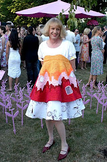
Grayson Perry lives day in the life of a Surgeon!


I have always admired the work of Grayson Perry, even if I find some of it impossible to understand. In general, I prefer traditional Fine Art but Perry's twisted manner in which he evokes such dark subject matter in such an ornate, pretty way won me over. He recently re-entered my thoughts recently when it was in the news that he had witnessed open heart surgery, before creating an Urn to raise money for the Harefield Hospital in Uxbridge.


His work, from a distance looks so beautiful. It draws in the onlookers to pay more attention to detail. But as soon as they do they are inevitably shocked, even appalled, by what he's depicted. I love this!
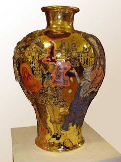


This Vase (left) is titled, 'We've Found the Body of Your Child'. Can you imagine a more inappropriate, dark and sinister name for a piece of Art? You find yourself admiring this tall, elegant vase covered in plated gold. Delicate trees stretch upwards, amongst the rolling snow-covered countryside. A typically beautiful winter landscape. However, the figures suddenly appear forlorn, maddened by grief. The words "cry baby" are aggressively etched into the side. The image all of a sudden becomes very haunting and it can confuse you. Why did you find such such a disturbing work of art so appealing initially? This is what Perry can achieve.


The vase (above, right) is called '37 Wanks Across Northern Spain'...I am not even going to begin to examine this one!


Its not too "in your face" like much of Modern Art these days, but it tests the boundaries in a far more skillful and effective way (in my opinion). His work is not only about the idea, but about fantastic craftsmanship too. He takes ages to create each urn, paying huge attention to not just the detail on the pot but the method in which he works the physical object. Plus, he wears a frock!